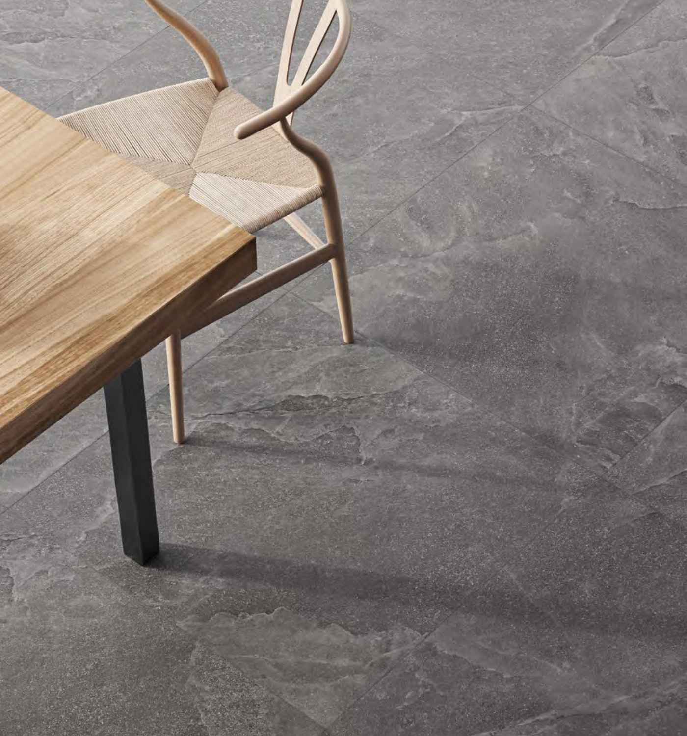
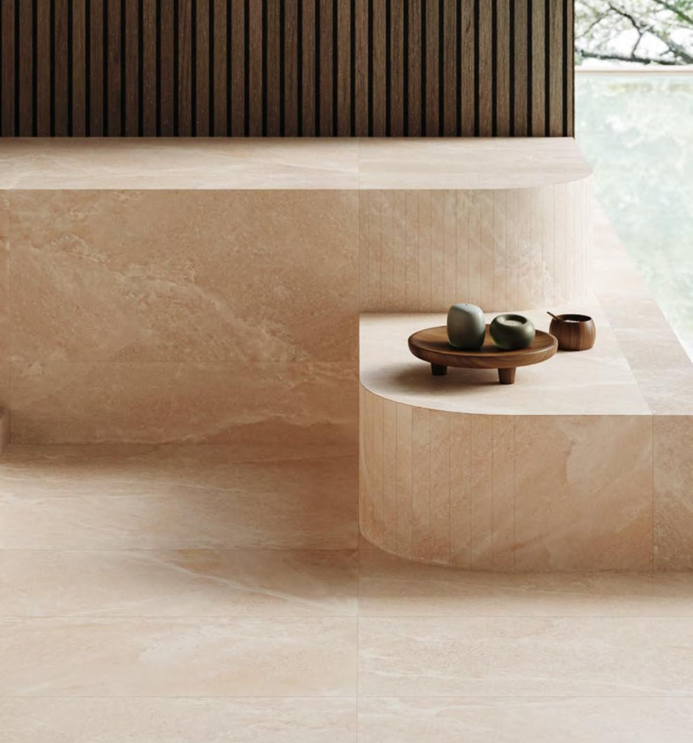


White space is often misunderstood as unused or wasted space.
In reality, it is one of the most active elements in any design system.
Space defines relationships, creates emphasis, and improves comprehension.

Without adequate spacing, content collapses into noise.
Users must work harder to separate ideas, identify structure, and find meaning.
White space does the opposite — it clarifies.
Breathing Room for Content
When content is given room to breathe, it becomes more readable.
Paragraphs feel lighter.
Headings feel intentional.
Calls to action stand out without shouting.
This breathing room reduces cognitive load.
Users can scan, pause, and return without losing context.
Luxury and Confidence
Many premium brands rely heavily on white space.
This is not coincidence.
Space communicates confidence.
It signals that content does not need to compete for attention.
Space is the pause that gives meaning to what surrounds it.
Designers who understand spacing design for comfort, not density.
And comfort keeps users engaged longer.
Explore More Articles
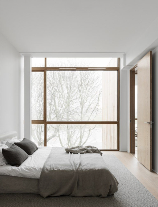
Effortless design is rarely effortless to create.
Behind every calm interface is a series of deliberate decisions — what to include, what to remove, and what to leave untouched.
The absence of visual noise is not accidental; it is designed.
Users do not experience layouts as grids or systems.
They experience flow.
They notice when things feel intuitive, when information arrives at the right moment, and when interactions feel natural rather than forced.
Hierarchy Before Decoration
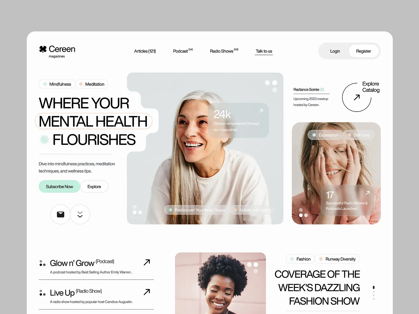
Strong design begins with hierarchy.
Before color, before animation, before visual effects, there must be clarity.
Users should instinctively understand where to look first, what is important, and what action is expected of them.
Typography plays a critical role here.
Font size, weight, line height, and spacing all communicate meaning.
When hierarchy is clear, the interface teaches itself.
Good design explains itself without words.
Removing Friction
Friction appears when users have to think too hard.
Confusing labels, inconsistent spacing, unnecessary motion — all of these interrupt flow.
The goal of design is not to impress, but to remove obstacles.
When friction disappears, users move confidently.
They feel guided rather than instructed.
This sense of ease builds trust and encourages exploration.
Why Calm Wins
In an environment saturated with information, calm becomes a competitive advantage.
Design that feels effortless respects attention instead of competing for it.
By focusing on clarity, rhythm, and restraint, designers create experiences that feel timeless rather than trendy.
Effortless design does not shout.
It lasts.